Understanding Color in digital tools
using saturation and value on a color wheel to make easy color palettes

I was always fairly confused by the color wheel and not entirely sure how to use it. I tend to like more desaturated colors, but I wanted to use color theory in my color schemes like compliment, split compliment, triadic that I was reading about.
An easy way I found you can do this is:
take the color wheel into Photoshop, Procreate or whatever you’re using
duplicate it twice
desaturate both
darken one
lighten the other.
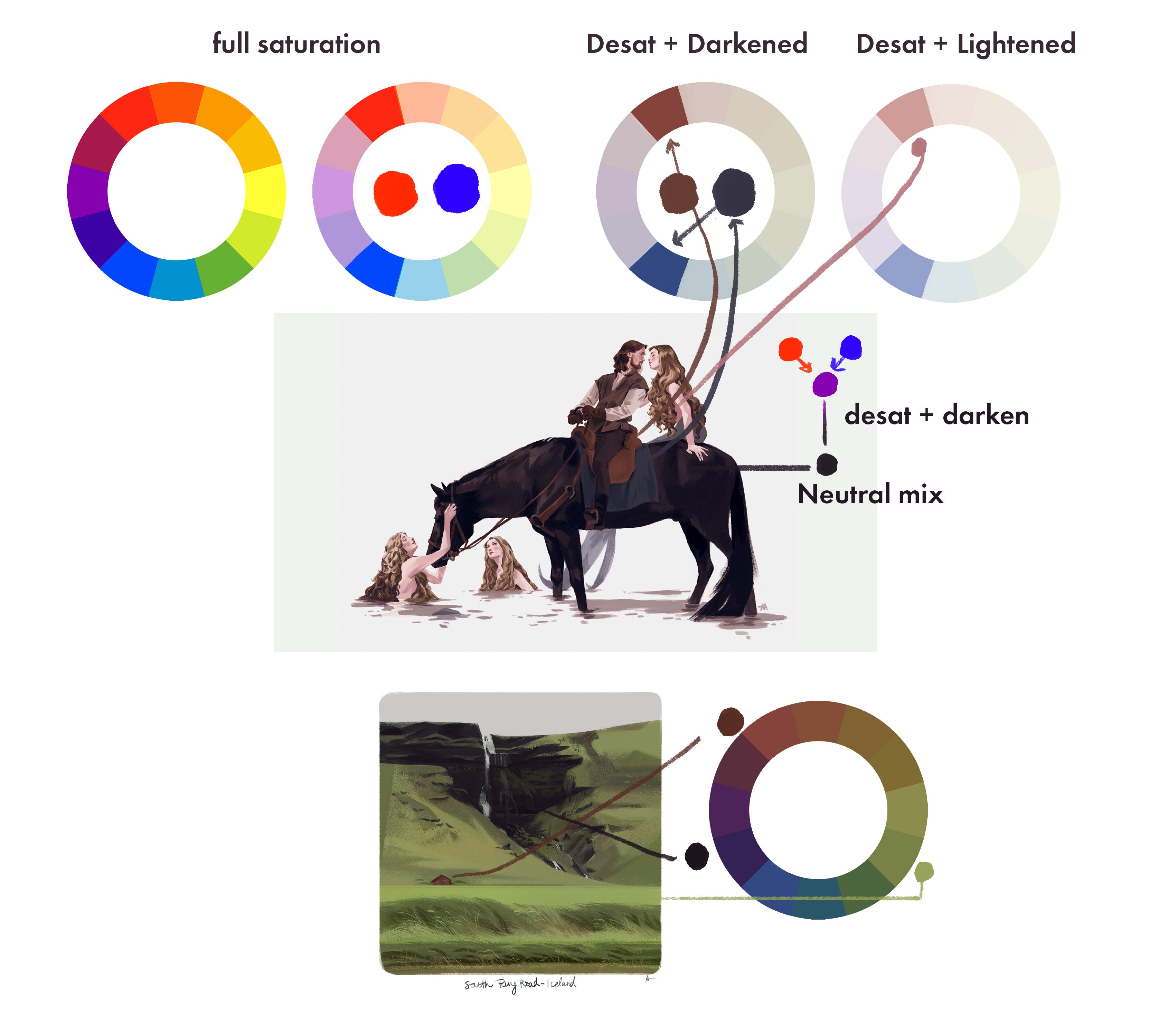
From here you can see you can easily get a color palette like a tertiary or split compliment, then make one of those colors really saturated, and the others more desat. You get so much more variety this way, and you can adjust the value and saturation as much as you want.
If you’re confused on what I mean by value or saturation, keep reading:
Color is really the combined result of hue, saturation and value.
Hue: red, orange, yellow, green, blue, purple
Saturation: I think about this like drops of ink in a glass of water. if you drop one drop of blue ink into a full glass of water, the resulting water will not be super blue, it’ll be slightly blue tinted (so a desaturated blue). If you drop 10 drops of blue ink into a glass of water it’ll be fully saturated blue.
Value: How light or dark it is on a scale of white (lightest) to black (darkest)
Imaging software adds another one, opacity. that one can be confusing because really all it means is transparency. how see through something is or isn’t. how your colors change depends entirely on what’s underneath it when you adjust that slider. so the value will either lighten or darken and the saturation will change with it based on what’s below.
Here’s how you can use that above information to understand the sliders in imaging software. I use Photoshop so that’s what I’ve used here but it’s the same on anything:
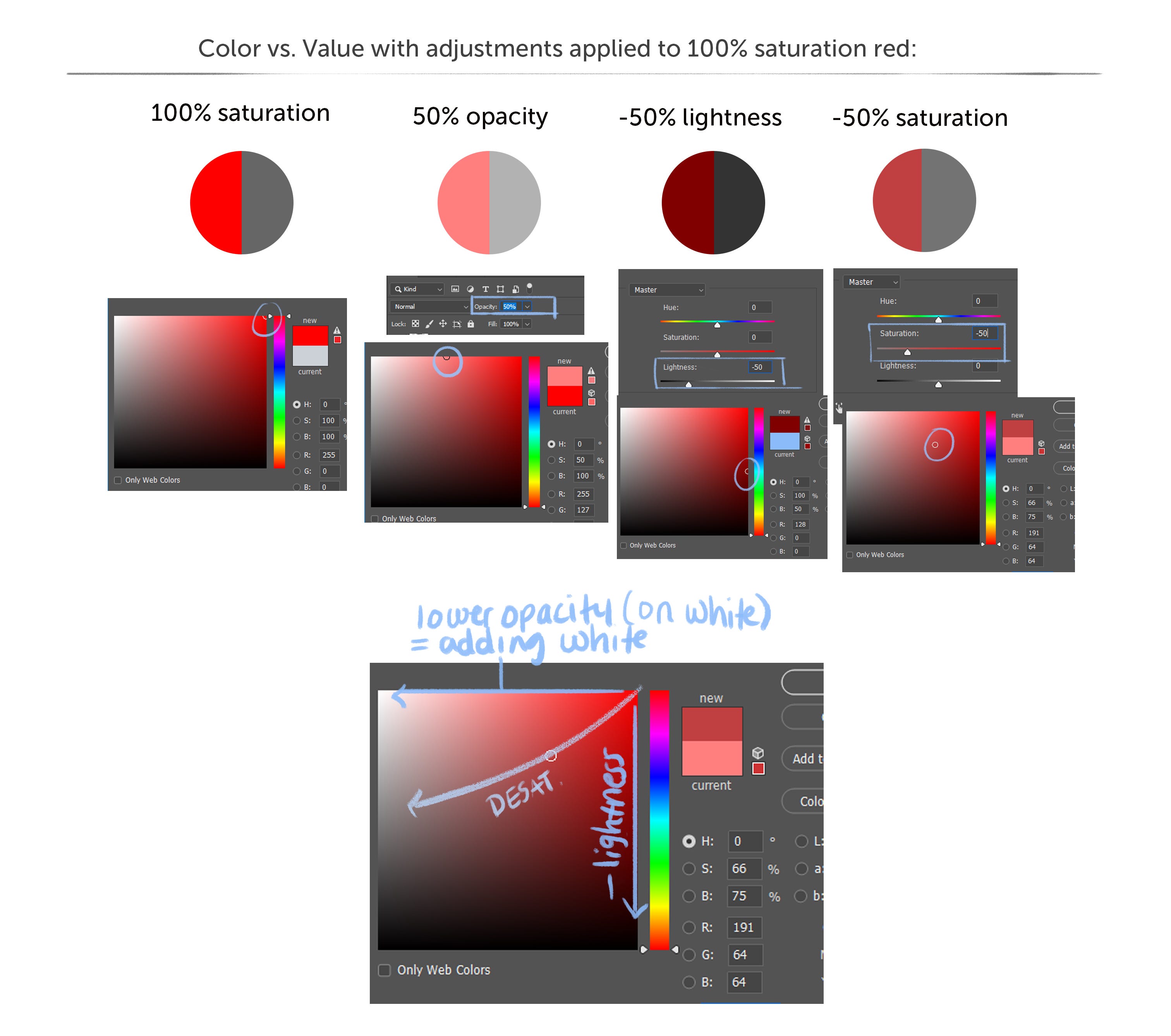
In the first panel, I’ve chosen 100% opacity red. in the square color picker that’s the top right corner. If you were to look at this in just black and white with no hue, it’s middle grey. (the value of full opacity red)
next to it, I’ve lowered the opacity to 50%. if you color pick this red, you see it’s halfway between pure red and white. Moving from right to left changes the value and it also changes the saturation. You can see in the color panel that the saturation has also gone down to 50% with the opacity change as it moves closer to white.
in the third panel, I’ve gone back to that full 100% pure red and I’ve darkened it. This only changes the value. It moves the color halfway between pure red and black. It’s a darker, deeper red, but still full saturation. this is still 10 drops of red ink in the water cup.
Now I’ve changed the saturation. so now you can see it’s moving diagonally. This is where the square can be a bit confusing for people. The saturation changes from right to left. it darkens from top to bottom. so when you desaturate something, it moves across at a sort of diagonal. This is why so many people recommend using the sliders instead of this confusing color picker because it’s just not super accurate and is a bit unintuitive.
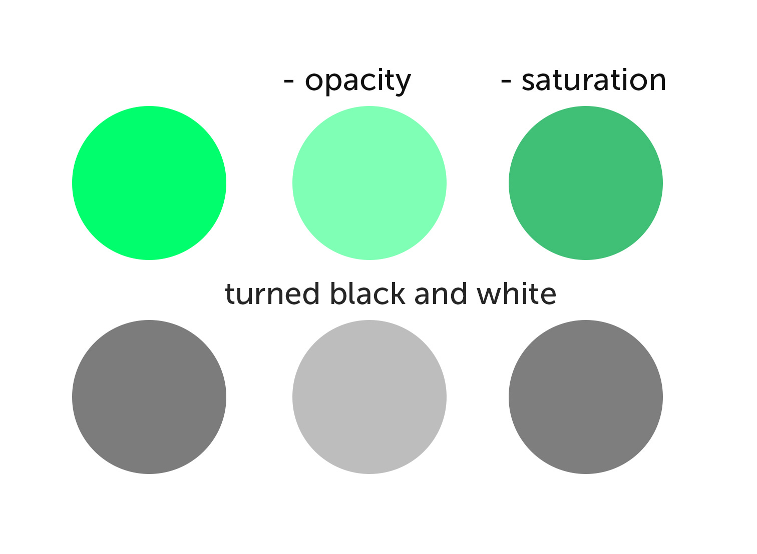
Here’s another way to think of it. If I take a green circle and lower the opacity, it changes the value with it (this makes sense because opacity is just transparency, I’m letting more white show through. if the background was dark, it’d darken it). However if I change just the saturation, the value stays the same.
Here is how opacity is impacted by what is behind the object you’re adjusting opacity on. In all of these I kept the left circle at 100% opacity, 100% saturation. The right circle is a duplicated version of the left. I only adjusted the opacity. When I color picked that circle where I only lowered the opacity, I found that the saturation was lowered more when there’s something light behind it than when there’s something darker, and it was lowered the least when there’s something saturated behind it. That’s because as we saw above, moving towards light takes saturation away, and since opacity is just transparency, if what’s below it is already saturated, it’s going to take some of that on.

I know some of this can be fairly confusing but really all you need to truly take away from it is this: Knowing how and when to use the sliders in your digital tool will help you a lot in figuring out color and how to get the colors you’re after in a way that allows you to stick to your palette and not have to just randomly color pick from the square of confusion. Try doing any of these activities yourself. mess around with Hue, Sat, Lightness and Opacity to see how that impacts color and you’ll quickly see how all of this works together.
If you have questions, ask in the comments and I will either try to answer them there, or in a future post. Thanks!